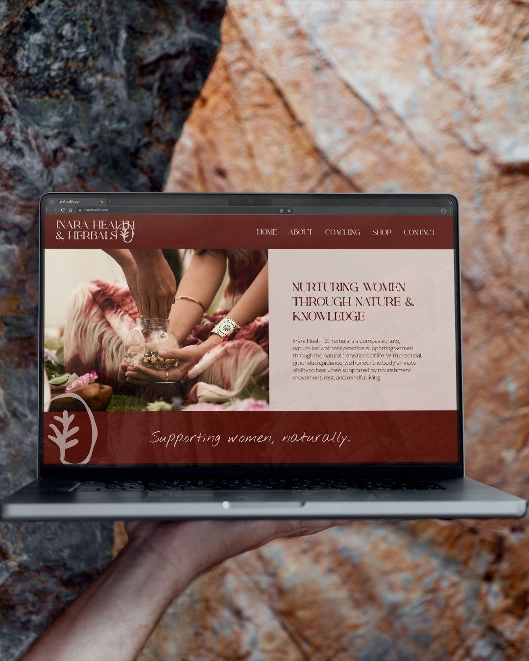
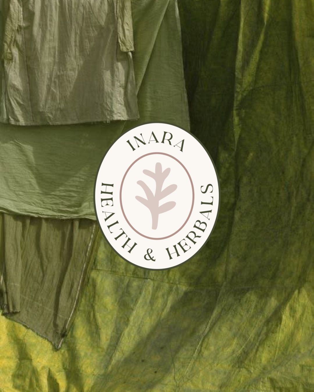
Inara Health & Herbals is a compassionate, nature-led wellness practice supporting women through the natural changes of life with practical, grounded guidance. Rooted in the belief that the body has an innate ability to heal when supported with nourishment, movement, rest and mindful living, the practice takes a natural, human approach to helping women feel proactive about their long-term health.
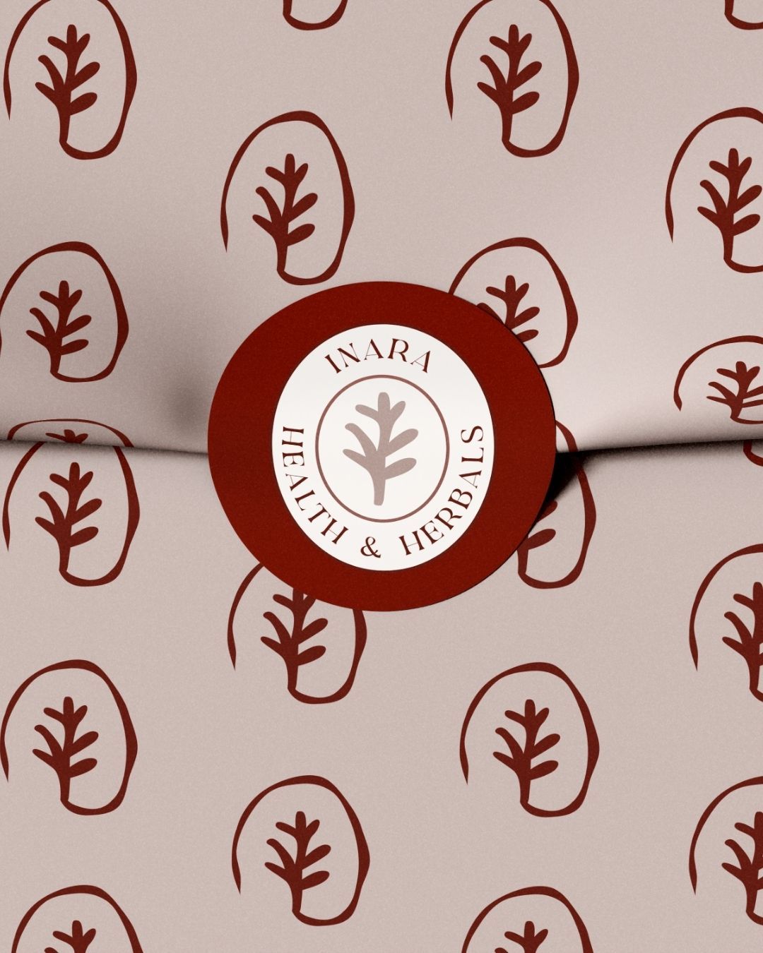
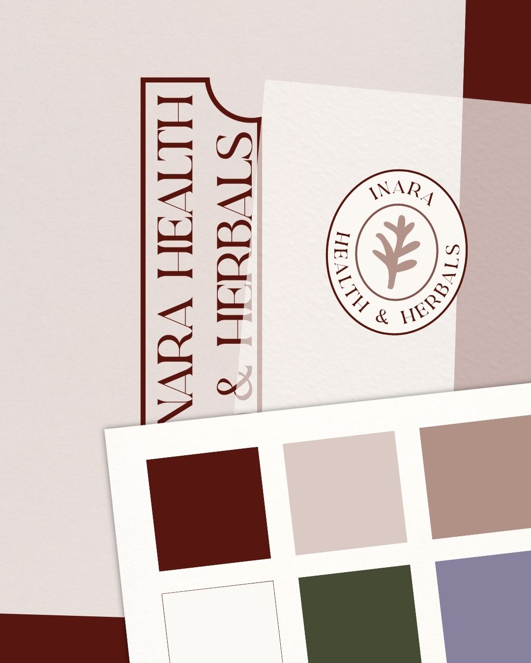
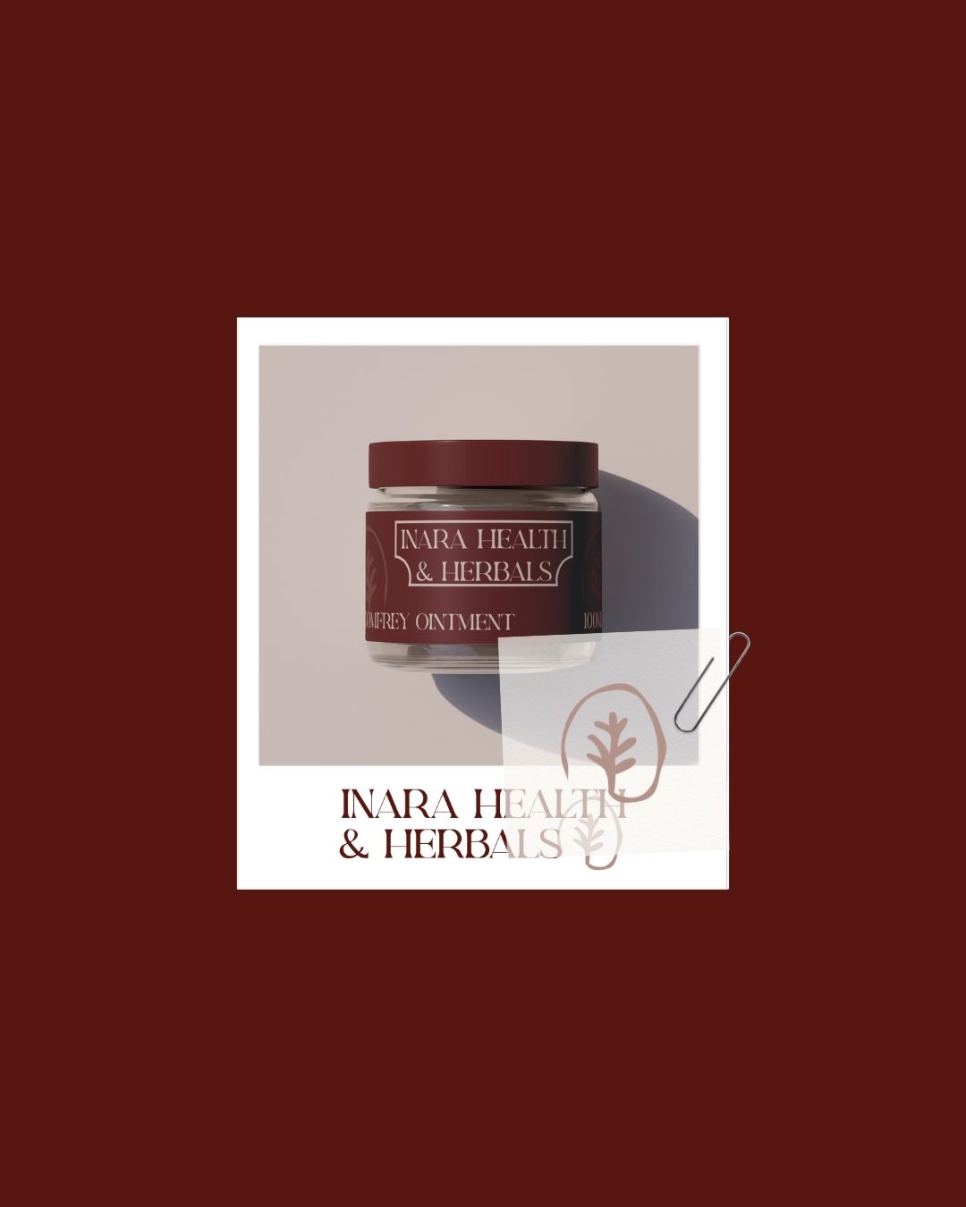
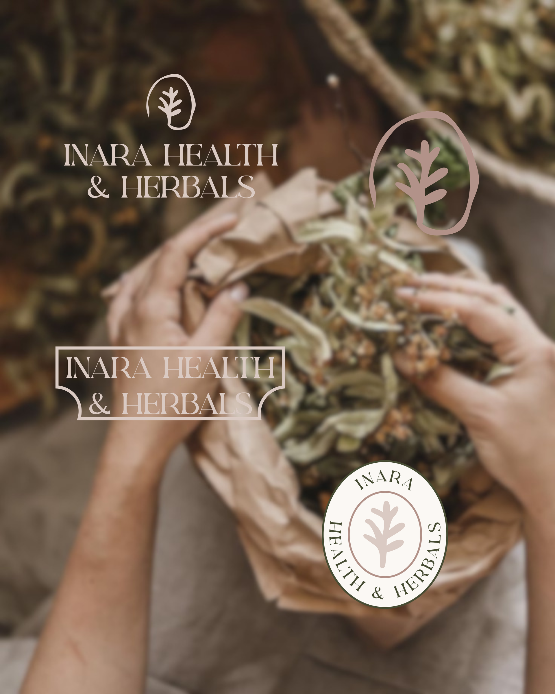
We developed a Foundations brand identity built around that same sense of nurturing expertise — soft, earthy and deeply human, positioned to feel supportive and trustworthy while avoiding the clinical or trend-driven aesthetic that saturates the wellness space. The primary logo, wordmark and supporting brandmark all carry that same grounded warmth through every touchpoint.
The palette leans into powder petal, dusty taupe and golden earth tones, paired with a herbal green and soft black cherry accent — creating a look that feels natural, calm and credible all at once, exactly the balance a nature-led health practice needs to strike.
The result is a naturopath brand identity that feels as considered as the care Inara Health & Herbals provides — giving this Far North Queensland wellness brand identity a presence that's approachable, trustworthy and unmistakably her own.