Locked Doors Distillery is a craft spirit brand built on sustainability, curiosity and authentic craftsmanship. As a nano distillery, the focus is on small-batch spirits — vodka, gin, schnapps, liqueurs, brandy and rum — made with locally sourced ingredients and a considered, community-centred approach, with future plans for a tasting room, cocktail bar and distilling classes.
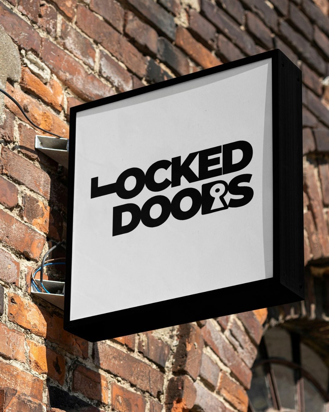
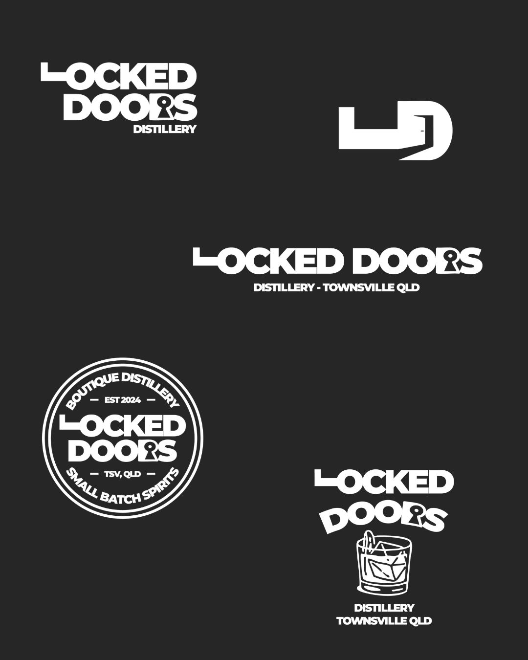
We developed a full distillery brand identity grounded in that sense of intrigue and discovery — an elegant, Art Deco-influenced aesthetic that avoids cliché in favour of something timeless and considered. The primary logo weaves lock-and-key symbolism directly into the typography, with a rotated "L" forming a lock shape and a keyhole built into the "R", paired with a palette centred on black and white with select accent colours.
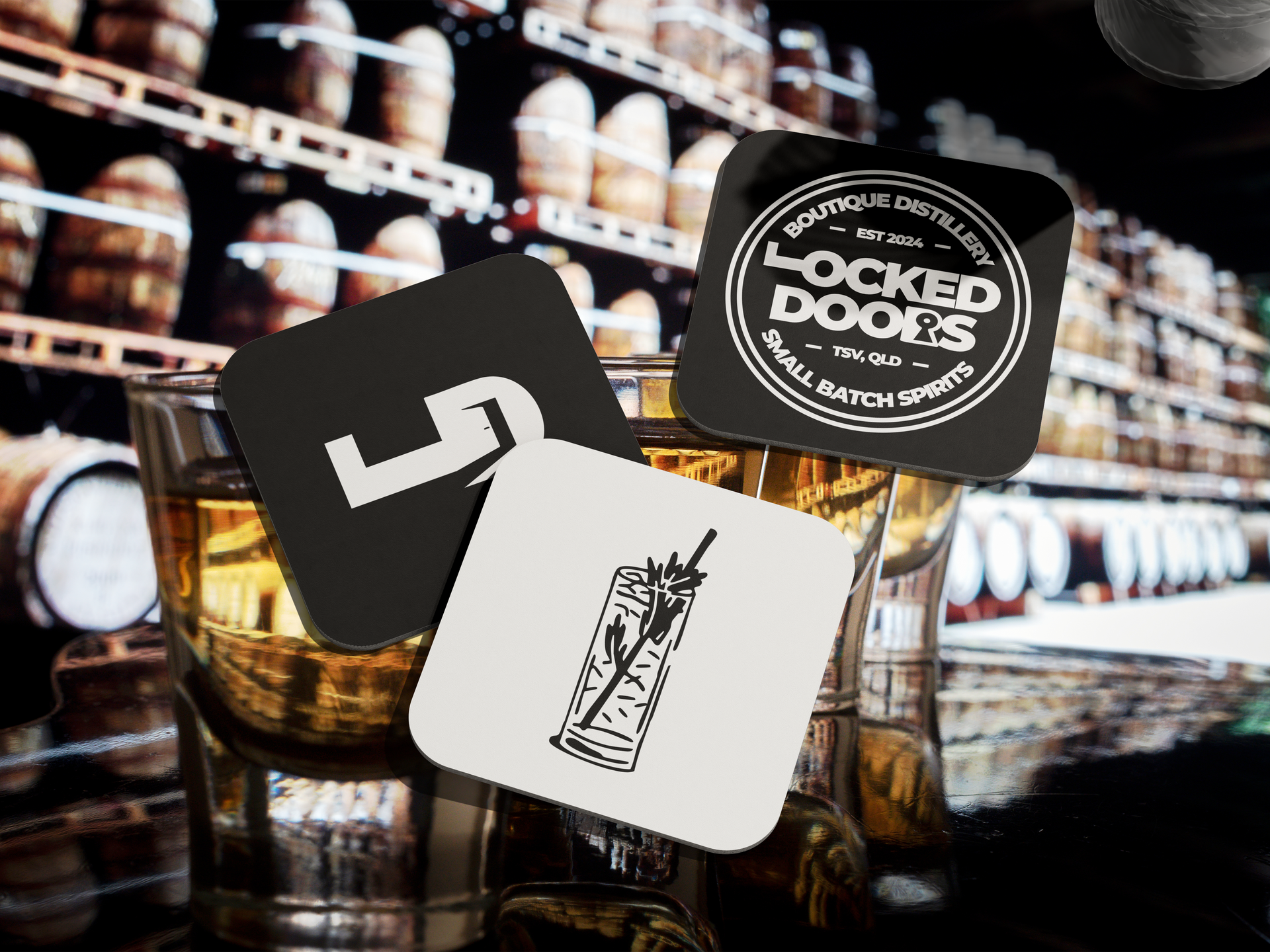
The identity extends across a full logo suite — primary, secondary and brandmark logos, plus a branded graphic variation and badge logo — giving Locked Doors Distillery a consistent, versatile system to carry across labels, packaging and future venue branding.
The result is a craft spirit branding system for this Far North Queensland distillery that feels exclusive and discovery-driven rather than mass-market — exactly the kind of quiet intrigue the brand set out to create.