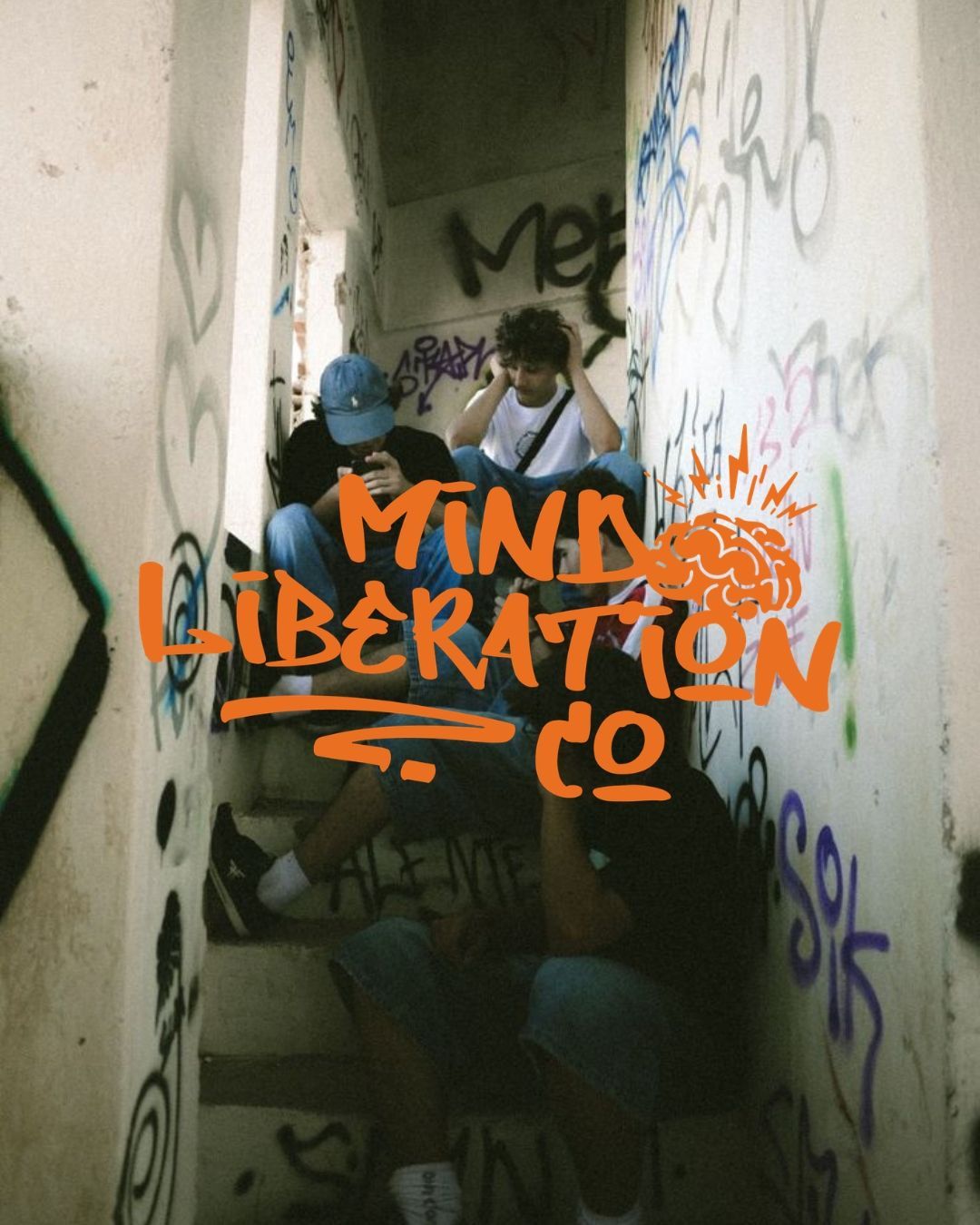
Mind Liberation Co is a purpose-driven not-for-profit dedicated to empowering 11–16 year olds to break free from limiting beliefs and discover their true potential. Built from lived experience and a deep understanding of the challenges teens face, the organisation champions self-awareness, resilience and financial independence through engaging programs and mentorship — helping kids find their own path rather than forcing them into a mould.
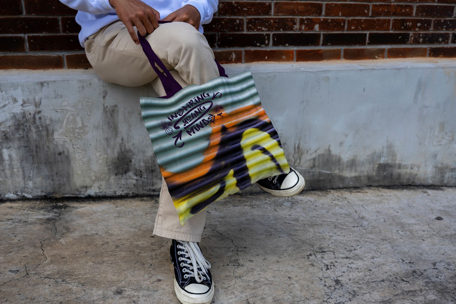
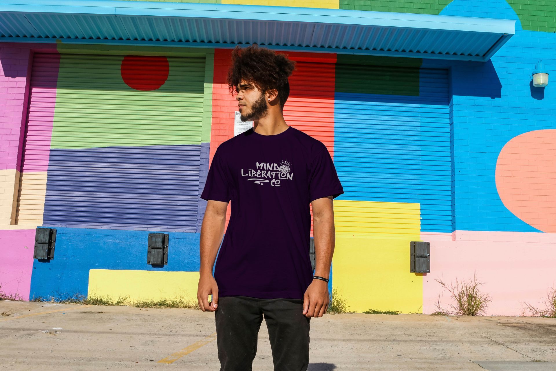
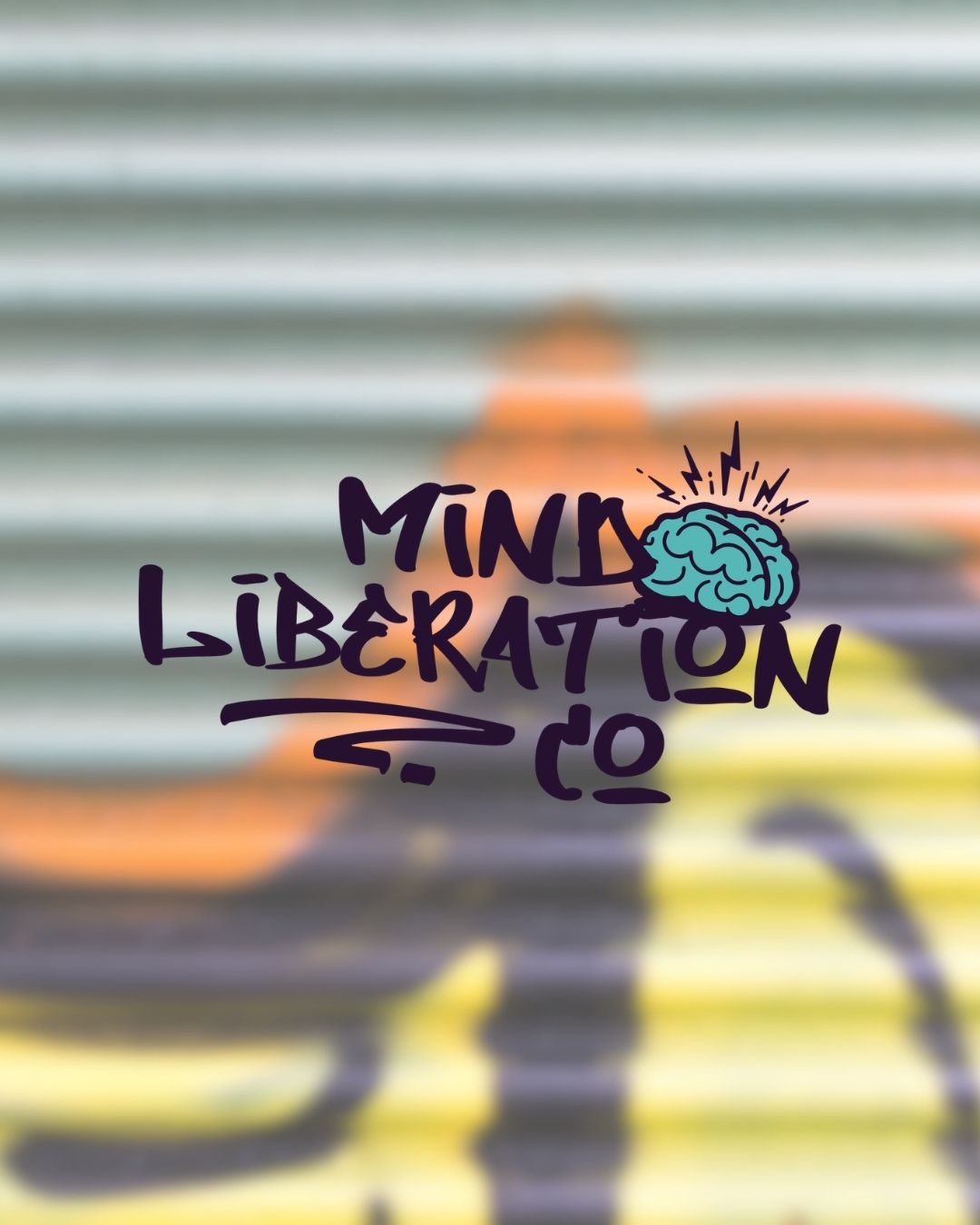
We developed a full brand identity grounded in that same energy — bold, graffiti-inspired typography paired with a brain and lightning bolt motif, symbolising the ignition and expansion of the mind. The logo suite carries a stacked, tag-style layout that speaks directly to teens who feel unseen or bored by traditional "inspirational" branding, while a grounded colour palette of deep purples, warm oranges and soft neutrals keeps it credible for parents, schools and funders too.
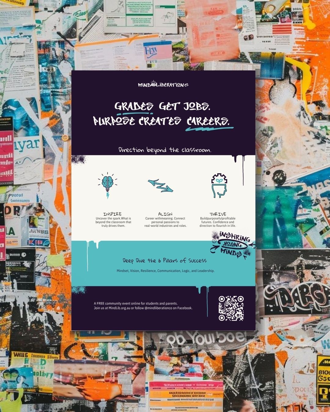
Alongside the identity, we designed a flyer for the organisation's free community event, "Deep Dive the 6 Pillars of Success" — built around the Inspire, Align and Thrive framework, giving the event clear, on-brand promotional material students and parents could easily engage with.
This kind of not-for-profit brand identity has to work double duty — credible enough for funders and parents, bold enough to actually land with teenagers — and that's exactly the balance Mind Liberation Co needed for its youth program branding to succeed.