

How to Choose Fonts, Colours and a Brand Vibe That Actually Connects
Your brand's look and feel is often the first impression someone has of your business — but with endless options on Canva and Pinterest, choosing the right fonts and colours can feel like a full-time job. With a bit of clarity and strategy, you can land on visuals that connect with your audience instantly, wherever in FNQ you're based.

DEFINE YOUR BRAND PERSONALITY FIRST
Think of your brand as a person. Is it fun and playful, calm and grounded, or luxe and polished? Write down three to five words that describe the vibe before you touch a single colour swatch.
CHOOSE A COLOUR PALETTE WITH INTENTION
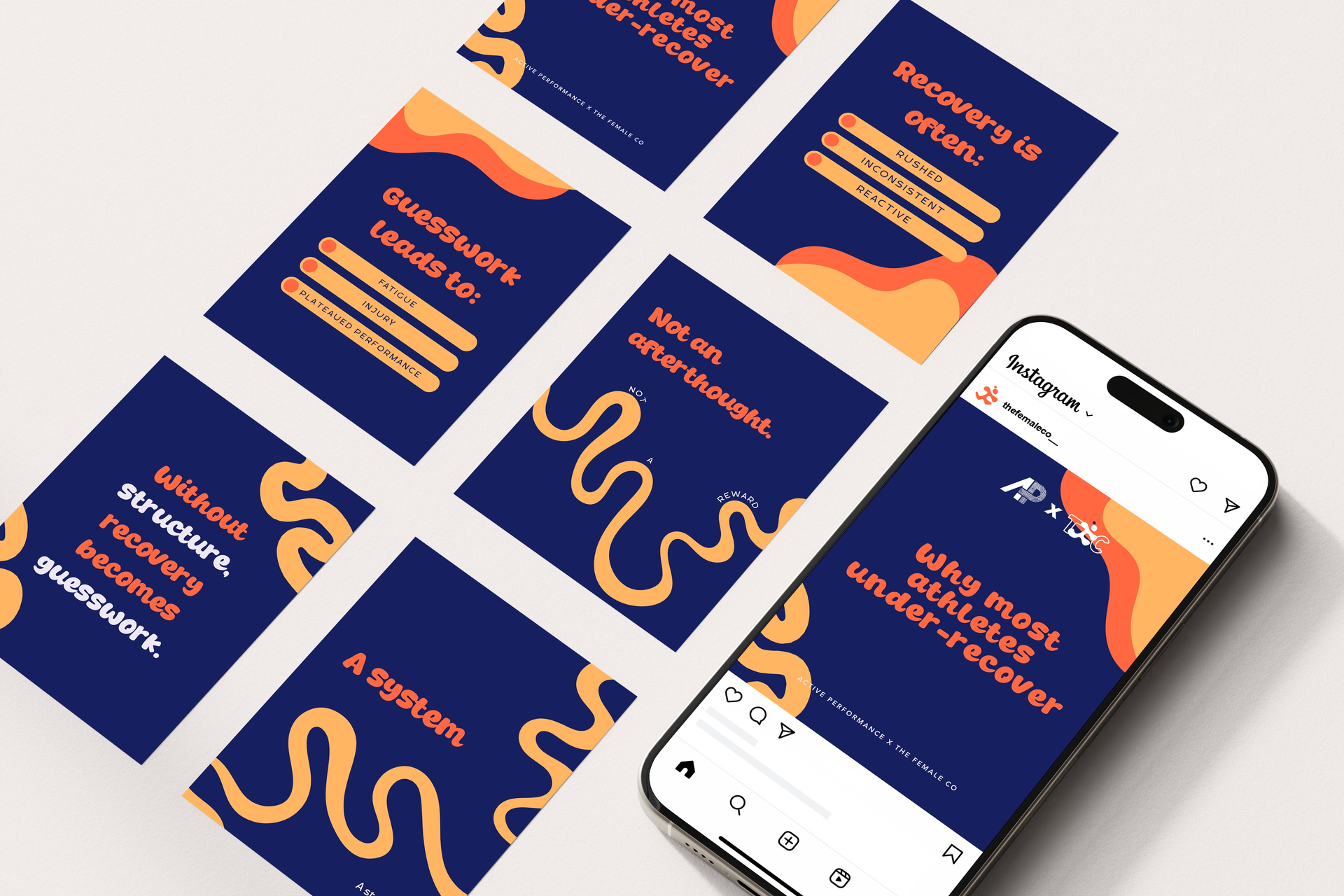
Colour carries meaning. Earthy tones lean into trust and calm — a natural fit for wellness or sustainable brands. Brighter colours bring energy and playfulness, ideal for events, cafés or kids' brands. Neutrals speak to simplicity and elegance, perfect for luxury services. FNQ's own landscape — the reef, the rainforest, the coastline — is often the best starting point for a palette that feels authentic to your business.
KEEP YOUR FONTS SIMPLE
Two fonts is usually plenty: one for headings, one for body text. A classic pairing like a serif with a sans-serif, or a bold display with a light sans-serif, keeps things clear and considered without overcomplicating the mix.
MATCH THE VIBE TO YOUR AUDIENCE
Are your clients casual or corporate? Booking a luxury service or looking for something fun and approachable? Every visual decision should speak directly to the people you actually want to reach.

Your brand visuals are the silent language of your business — the right fonts, colours and overall feel signal instantly whether you're the right fit. If you're stuck in Canva overwhelm, that's exactly where we come in.